5 Critical Factors for Optimising A Dentist Website

Any business that must rely on generating leads and sales from their website, would at some stage considered how they might get more of their website visitors converting into sales.
The challenge is that most websites convert less than 5% of new visitors into sales. Having such a conversion rate means that the vast majority of visitors (95% or more), aren’t making a buying decision.
A dentist website is no different, and this can seriously impact the outcome of a dental marketing campaign. The good news is that there are ways of optimising a dentist website so that more of your visitors convert into patients. Here are five tips for optimising a dentist website, and ensuring you will boost the performance of your website.
The Homepage
The homepage is perhaps the most important place to start when it comes to optimising a dentist website. When users arrive, they have three fundamental questions: Am I in the right place? Does this site have what I am looking for? And what do I do now?
One of the key tasks is to make sure your homepage does a good job of answering these 3 questions. Another important task is to ensure your homepage effectively gets visitors OFF of the homepage and into your service pages, or other pages that provide your visitors with the information they seek.
A poorly designed homepage will immediately turn good prospects away. Whereas a homepage that has been well optimised, more people are likely to stay.
In some recent research, 76% of consumers said the most important factor in a website’s design is “the website makes it easy for me to find what I want.”
An essential part of “easy to use” is to make the homepage intuitive. Intuitive design means that when a user sees your homepage, they know exactly what to do next, and can focus on the task at hand without having to stop and think. The way to make sure people find what they want on your site is with good navigation.
How to improve your homepage navigation:
- Reduce the number of menu items – too many will clutter up the page.
- Avoid too many drop-down menus, they encourage visitors to skip important pages.
- Use descriptive menu items, using trigger words. This is important for both the user and the search engines.
- The order in which you prioritise your navigation items is important. Items at the beginning and the end are most effective, as this is where attention and retention are highest.
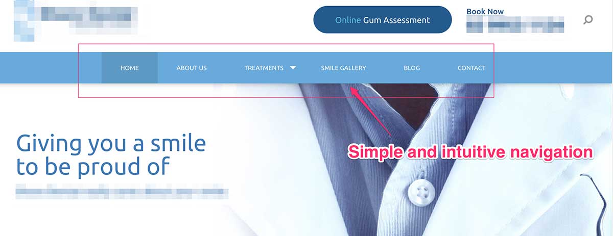
The screenshot below is an example of an optimised homepage navigation. The menu is simple and intuitive, and it’s easy for a new visitor to find what they need.

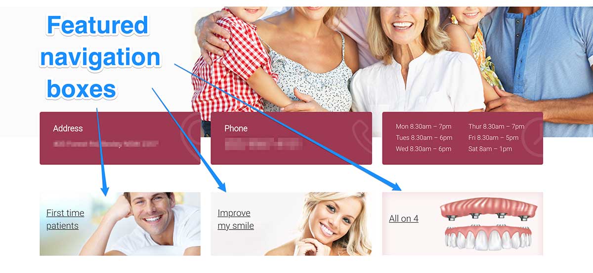
Another important consideration for optimising a dentist website, is to use featured navigation boxes. A featured navigation box will grab the attention of your visitors, and direct them towards a ‘high value’ page on your website.
A ‘high value’ page is a page that has important information and often results in the visitor taking action. An example of such a page is a “first time patient” page. Which is designed to help educate first time visitors about the process and benefits of becoming a new patient at your practice.

Visual Hierarchy
This is one of the most important principles of effective web design. It’s the order in which the human eye perceives what it sees. Certain parts of your website are more important than others, and so the important parts get more attention than the less important parts.
Strong visual hierarchy dictates that the various elements of the page such as content, images, web forms, call-to-actions etc are positioned based on their level of importance.
Rank your most wanted actions for every page, based on your business objectives. If you don’t create a specific goal for that page, you won’t know what to prioritise</p?
When you are fully aware of your priorities, you can set the visual hierarchy. Make sure that important stuff stands out and is positioned where people can see it best, while the less important elements are lower in the visual hierarchy.
The About Us Page
Did you know the ‘about us’ page is one of the most visited pages on a dental website? It also happens to be one of the most commonly overlooked pages on dentists websites. Which is a great reason why you should make yours different.
The ‘about us’ page is a great place to share a story about your practice. How you first started in dentistry, and about the journey that lead you to being a dental practice owner. There Isn’t a more effective way of relating to people than by using a story. A good story will make it easier for prospective patients to relate to you. It will provide more meaning towards your dental practice.
Conversely, when your ‘about us’ page is bland, boring, or you present a formal voice in an attempt to sound professional, you’ll inadvertently do what almost all dentists do with their ‘about us’ pages. You’ll waste a wonderful opportunity to build trust and rapport with your visitors.
Relax the tone of the page, create an engaging story, provide some interesting and insightful information, add some pictures and you’ll be on your way to creating a page that warms your prospects to your practice.
The Value Proposition
One challenge that the majority of dental practices are up against, is competition. Having competition is a double edged sword. On the onehand it indicates that there is a strong and healthy market out there. But on the other hand, it means dental practices have to step up and get noticed.
The average dental patient doesn’t understan what separates one dental practice from all the others. So your website must educate and inform people about what makes you different or unique. If your marketing message is too similar to your competion, then your market will not have a compelling reason for choosing you.
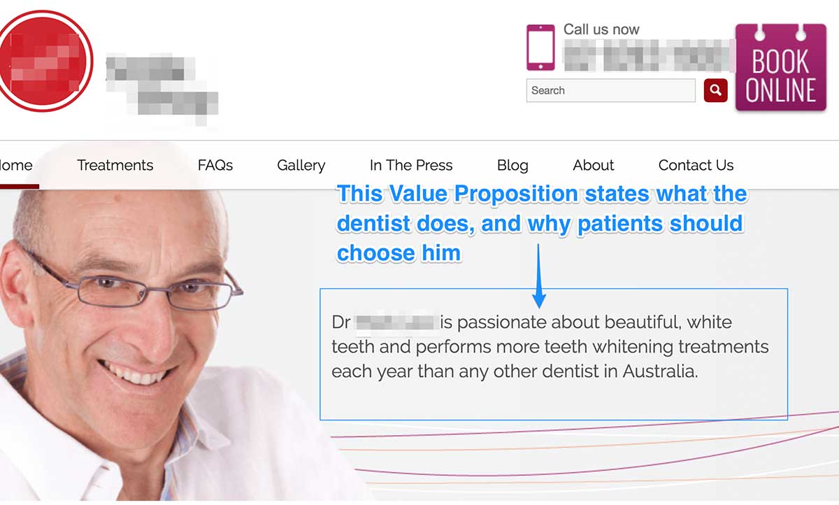
A value proposition is what’s needed if you’re trying to stand out from other dental practices. It helps to educate prospects about why they should choose you over the other dentists.
A value proposition should be written on your homepage, and too for your most important dental services pages. The best value proposition clearly states what you’re offering, for whom it is for and what benefits they will get. If those questions are answered in your value proposition, then you’re on the right path.

I have a written a comprehensive blog post on how to write a compelling marketing message.
The Lead Magnet
Most of your visitors won’t take action on their first visit. That’s because most people are either in the ‘research phase’ or not yet convinced to make a decision.
With this in mind, it makes sense to collect their email so that you can maintain a relationship with them after they leave your website.
If try to capture their email address before a visitor leaves your website, you have the opportunity to build a longer term relationship with all those people who decided not to take action on your website.
The secret with this is to gain a micro commitment from the visitor first, by exchanging their email address for something of value.
You must convince your visitors that subscribing to your list will give them a valuable payoff. Getting their email isn’t easy, so you must offer something they value in return.
For this, you will need to create a lead magnet. A lead magnet is something of value you that you offer to your prospects for free. The key to a good lead magnet is it offers an immediate solution to a problem they might currently have. Or it will help them get closer to whatever goal they are trying to achieve.
Some ideas for dental lead magnets include:
- Report or Guide
- Resource List
- Quiz
- Cheat Sheet
- Handout
- Video Tutorials
- Discount Voucher
- Free Assessments
The goal is to come up with a lead magnet that get’s visitors excited. If you do this well, the lead magnet can convert between 25% and 50% of your visitors onto your subscriber list. But if done poorly, then you might be lucky to get any visitors onto your subscriber list.
The Final Word
These 5 factors for optimising a dentist website are excellent methods for improving the performance of your site. Even if you already have these 5 factors on your website, it’s worth doing a short exercise. Check these 5 factors,and using the information in this article, try to notice where you can make some improvements.


